University Marks
A logo is not a brand. A brand is not a logo.
SJSU does not have a single “logo.” SJSU uses a series of marks to distinctively portray our name and build memorable recognition or our brand.
Our university marks support our brand (aka the story of San José State’s people). Learn how to tell those stories by reviewing SJSU's Editorial Style and downloading the Brand Style Guide [pdf].
Using these university marks across all platforms — in printed materials, on websites, blogs, social media channels and in SJSU videos — helps to deepen recognition of San José State among our audiences and visually connects the many ways we tell the stories of Spartans.
On this page:
Download University Marks
Variations and Usage Guidelines
Primary Logo

University Wordmark
SJSU Monogram

Spirit Mark

Zip file contains one color and two color variations.
As of September 2018, SJSU has “one Spartan, one spirit.” The university has merged the university spirit mark and the Athletics Spartan helmet, creating a stronger, more unified presence in our community.
NOTE: If you have created materials with either the spirit mark or Athletics Spartan helmet, please use the new Spartan spirit mark as you order and transition to new materials.
University Seal
The university seal is used as a formal symbol on official university documents and on materials produced for the president.
The seal is not a marketing logo. Use of the seal for any purpose other than those listed below must be approved by University Marketing and Communications department per consultation with the Office of the President.

Usage examples:
- President’s Office
- Commencement
- Formal admission letter
- Diplomas
The university seal is available by request only. To send us a request, please email brandpermission-group@sjsu.edu.
Campus Unit Lockups
While campus units may have their own lockups, the best way to distinguish your department or program is with people-focused storytelling. SJSU's Brand Style Guide [pdf] will help you support your storytelling with your lockup or the university's primary mark.
Color Options
All university marks may be used in these colors:
- Blue
- Gold
- Gray
- Black
- Reversed in white for various backgrounds*
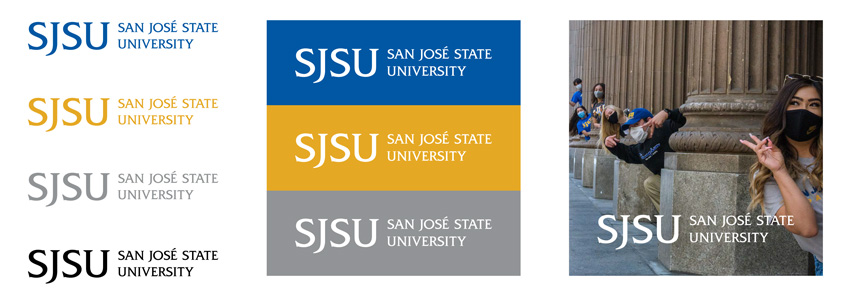
*Use only white logo when on photos, making sure there is enough contrast.
Clear Space
Do not crowd the university marks with other visual elements. Always give them plenty of room to help to ensure visibility and legibility.
Clear space around university marks no less than shown below.

Minimum Size
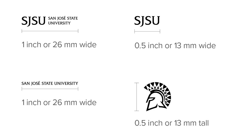
University marks should not appear smaller than the stated sizes below to ensure they are legible.
- Primary Logo: 1 inch or 26 mm wide
- University Wordmark: 1 inch or 26 mm wide
- SJSU Monogram: 0.5 inch or 13 mm wide
- Spirit Mark: 0.5 inch or 13 mm tall
What Not to Do
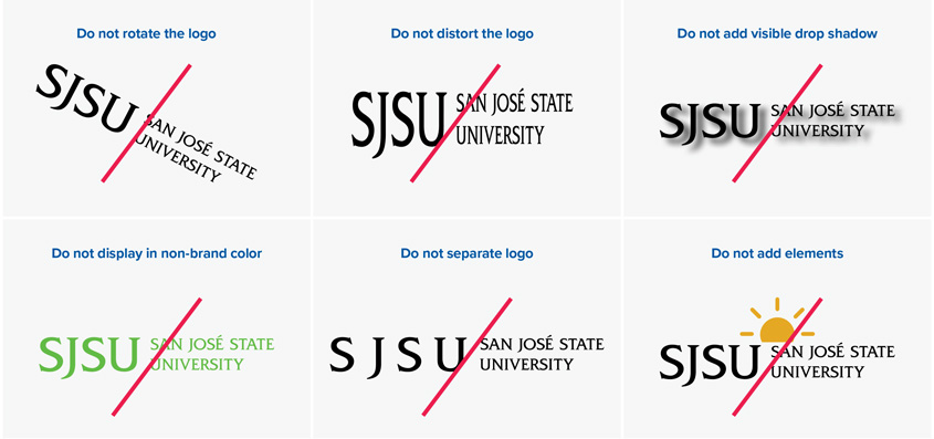
The below examples also apply to all university marks.
- Do not rotate the logo
- Do not distort the logo
- Do not add visible drop shadow
- Do not display in non-brand color
- Do no separate logo
- Do not add elements
